Overview
Goal: Improve referral performance by redesigning both the referrer and referee journeys—making rewards clearer, reducing friction, and increasing motivation across the funnel.
Outcome: Higher share intent, clearer reward communication, earlier referrer–referee linkage, and a more cohesive referral experience aligned with Ajaib’s acquisition goals.
Impact Summary
Before:
- Referral landing page had traffic, but low share rate due to unclear hierarchy and dual CTAs.
- Referee journey lacked value proposition clarity; referral code was applied late (post-KYC).
After redesign:
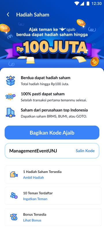
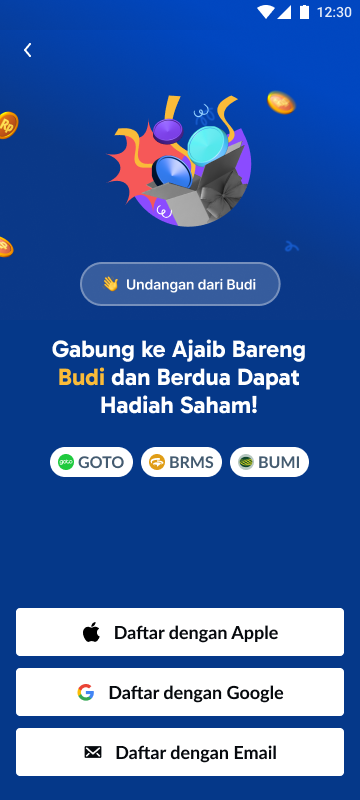
- A personalized referral landing page dramatically clarified reward + next steps.
- Auto-applied referral code removed friction and ambiguity.
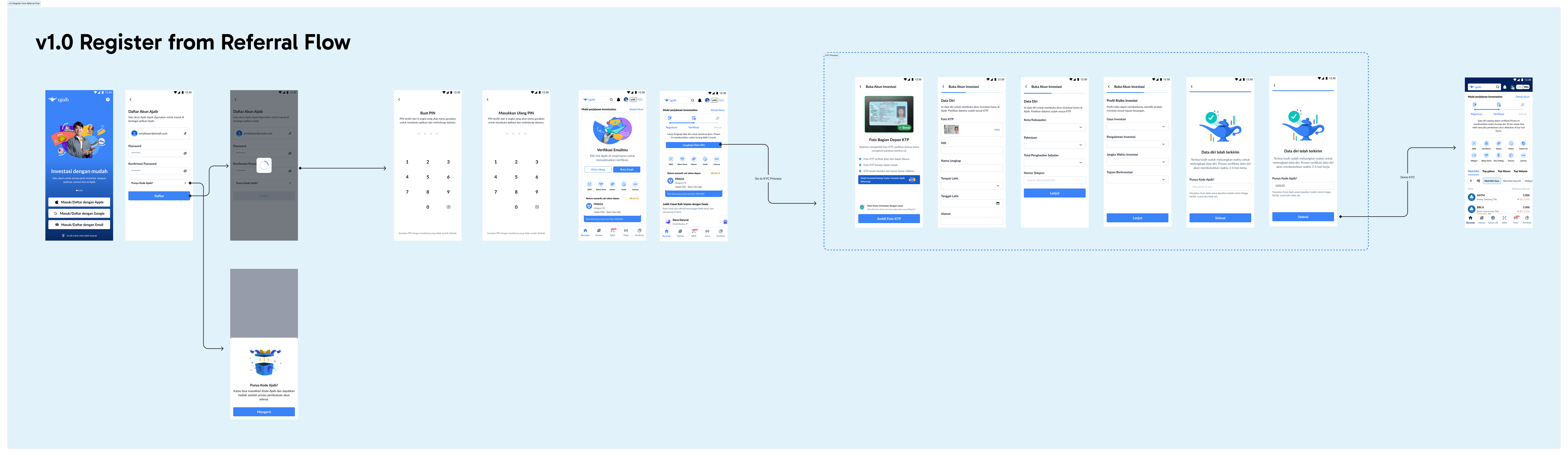
- Early linkage (post email verification) enabled earlier nudges and improved attribution accuracy.
- Single, high-contrast CTA improved referrer share intent.
- Cleaned up modal-based flows into a stronger, more motivating narrative.
Problem Framing
How might we create a referral experience that clearly motivates both the referrer and referee—while reducing friction and ensuring early, accurate referral linkage?
Key challenges:
- Reward message unclear or repeated too late
- Referees dropped because they didn’t see value early
- Dual CTAs on referrer page reduced decision clarity
- Referrer–referee linkage happened post-KYC, far too late
- Crypto app outperformed Stock app due to a simpler, single CTA
.webp)
Why This Matters
Referral is one of Ajaib’s strongest acquisition channels—low CAC, high trust, and strong viral potential. But the old experience created unnecessary friction:
- Referrers didn’t feel motivated (poor messaging, unclear CTA).
- Referees saw no reward until late in the funnel.
- Lack of early linkage meant lost attribution + no nudge ability.
In short: High traffic → Poor conversion.
Improving the referral journey directly impacts:
- KYC completions
- First trades
- Acquisition efficiency
- Organic growth loops
This project reshaped referral from a transactional action into a guided, motivational onboarding funnel.
My Role & Scope
- Mapping the full referral ecosystem (referrer + referee)
- Funnel analysis & pain point identification
- Designing the new referral landing page experience
- Redesigning the referral page UI + CTA strategy
Constraints
- Referral must remain on Blue-app (Ajaib Stock App) ecosystem
- Banners already compete for limited surface area
- Could not create new mandatory steps (flow must remain lightweight)
Ideation & Exploration
Before moving into solutions, I used Claude AI as a structured ideation tool to help me challenge my initial assumptions.
I explored different problem framings, motivational triggers, and sequencing of user actions. The AI-assisted reframing accelerated my ability to test multiple mental models quickly, while the final decisions were grounded in user behavior, data, and platform constraints.
Here is the key findings based on my assumptions
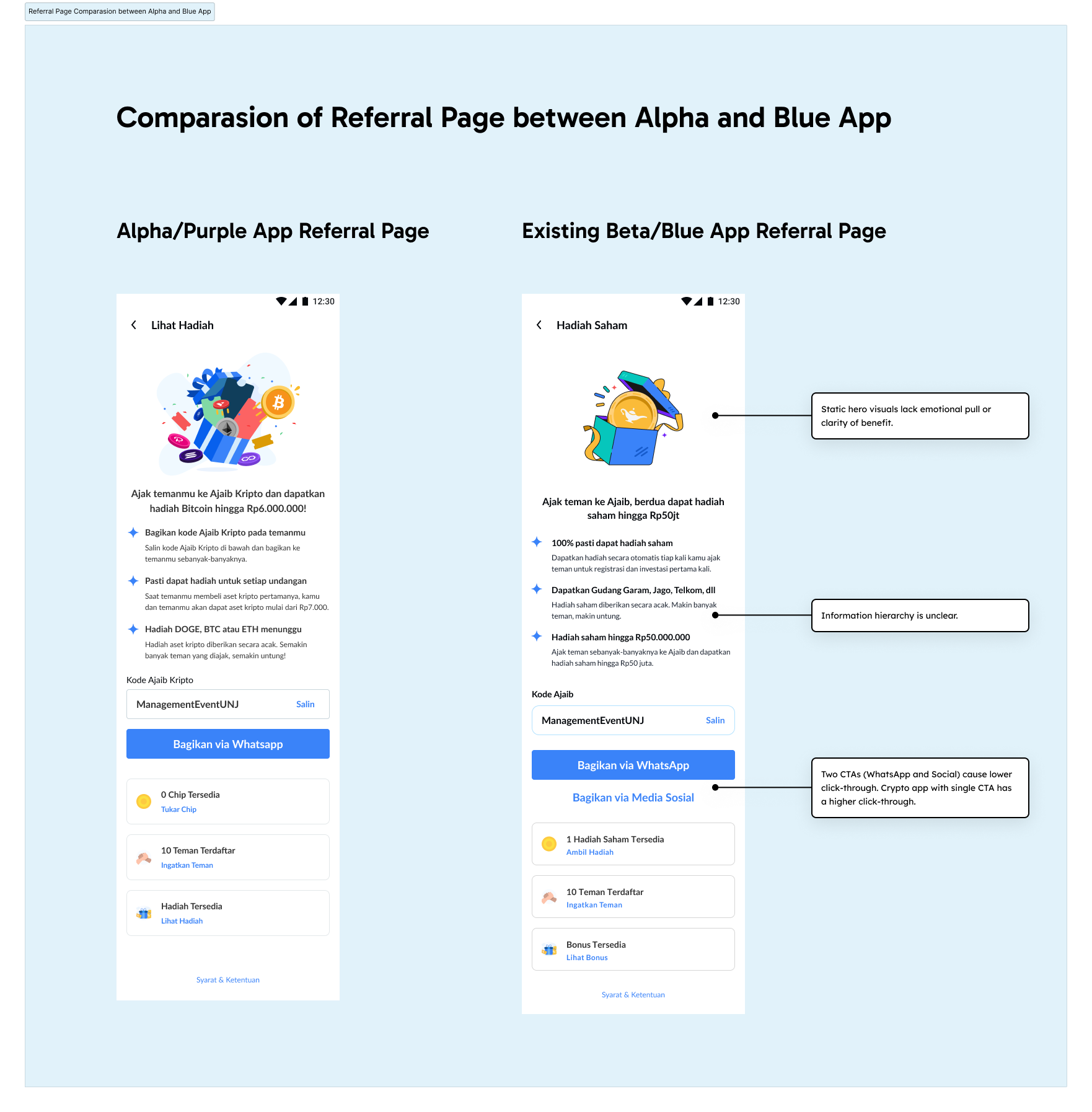
Referrer-Side Pain Points (Identified from Internal UX Audit)
- Static hero visuals made the referral page feel unexciting and low-value
- Two CTAs forced decision-making and lowered share intent
- Unclear information hierarchy and weak copy led to low perceived rewards
- No articulation of what specific stocks users could earn
- No motivational framing (“what’s in it for me?”)
- Lack of visual hierarchy caused users to skip or bounce
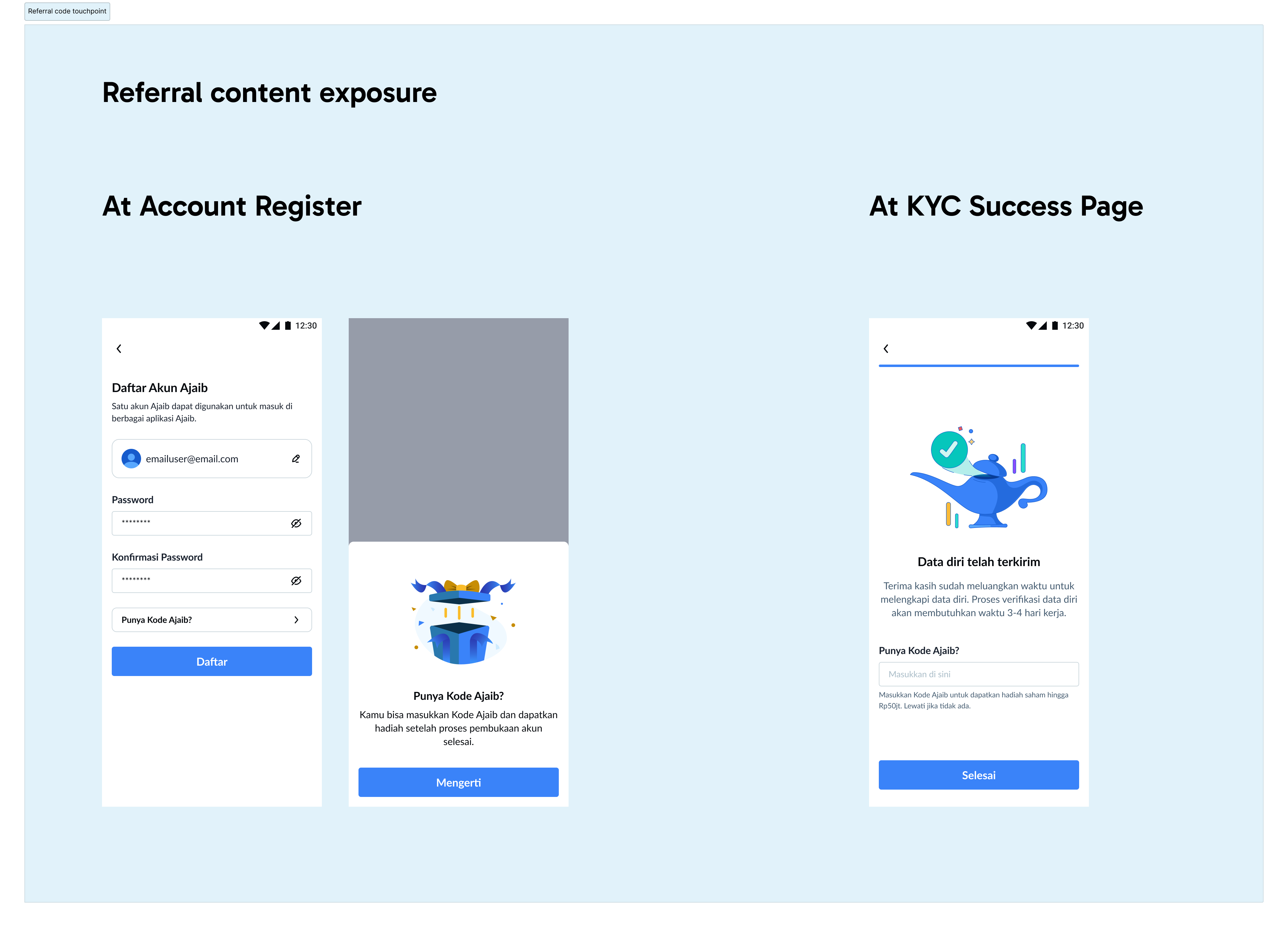
Referee-Side Pain Points (Identified from Research)
- No referral-specific landing page to create motivation
- Rewards unclear or not repeated at any stage
- Referral code hidden in a small modal
- No guidance on next steps (signup → verification → KYC → trade)
- Late referral linkage prevents progress feedback
Here's how I used Claude to create a more structured approach—not only for the Design team (including myself) but also to propose solutions to the Product Team, including suggestion on how to prioritize things.
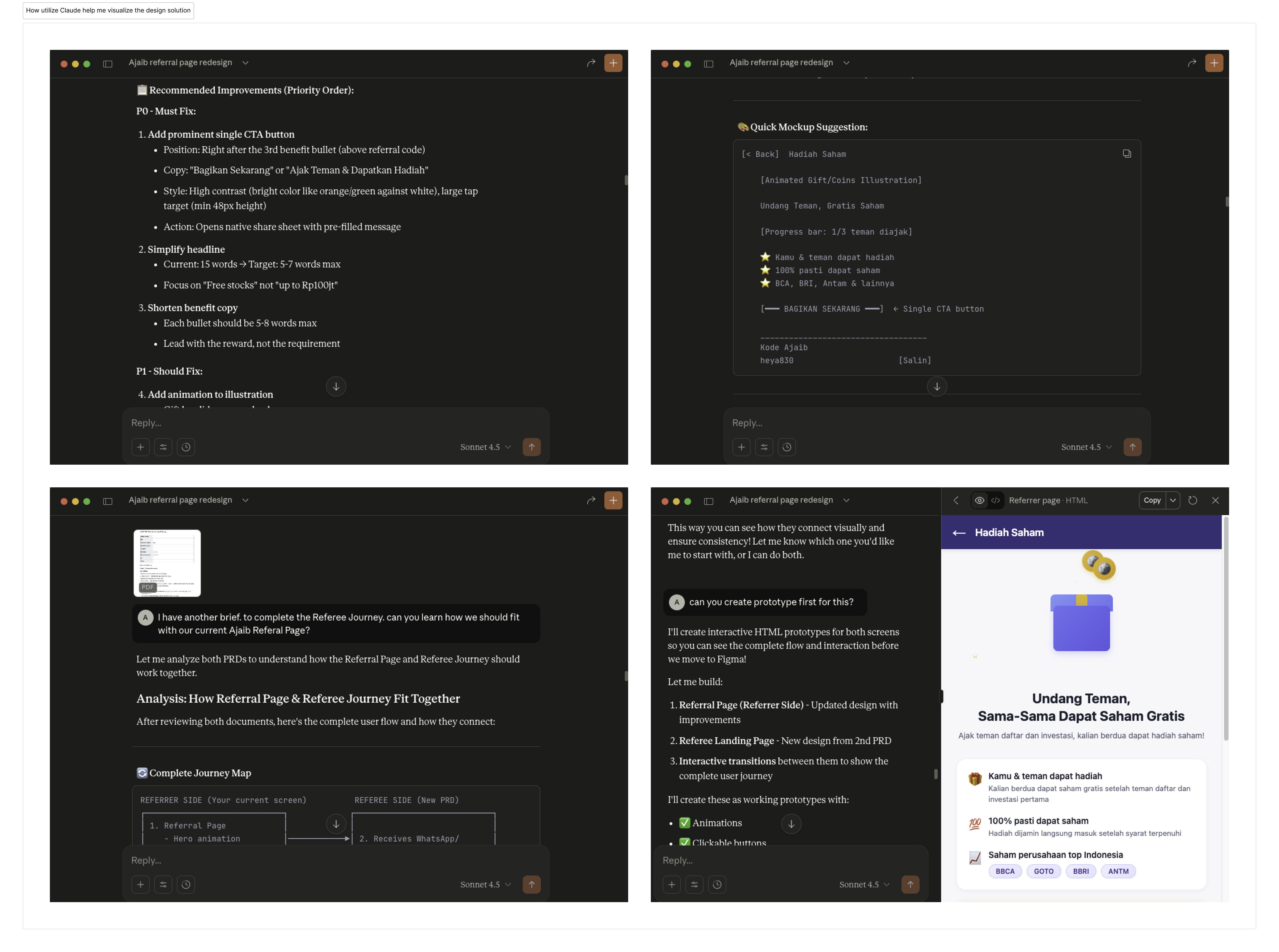
Claude chat can be accessed in
here alongside the prototype for
Referal Page and
Referee PageOnce Claude give me the first draft of the referral page (native app view) and referee page (landing page view). The next iteration become more properly shaped from my judgement as a designer who own the case.
What Was Broken & What Needed to Be Fixed
- The experience lacked motivation
Broken: No referral landing page → unclear value.
Needed: A reward-centered, personalized landing page. - The journey created friction early
Broken: Referral code information hidden in a modal.
Needed: Auto-apply code with upfront confirmation. - The steps were unclear
Broken: No explanation of signup → verify → KYC → trade.
Needed: Transparent step-by-step guidance. - Users weren’t compelled to share
Broken: Static visuals + two CTAs.
Needed: One strong CTA + improved hierarchy. - Referral attribution occurred too late
Broken: Linkage only after KYC.
Needed: Early linkage post email verification for nudging.
And here is the Final UI version
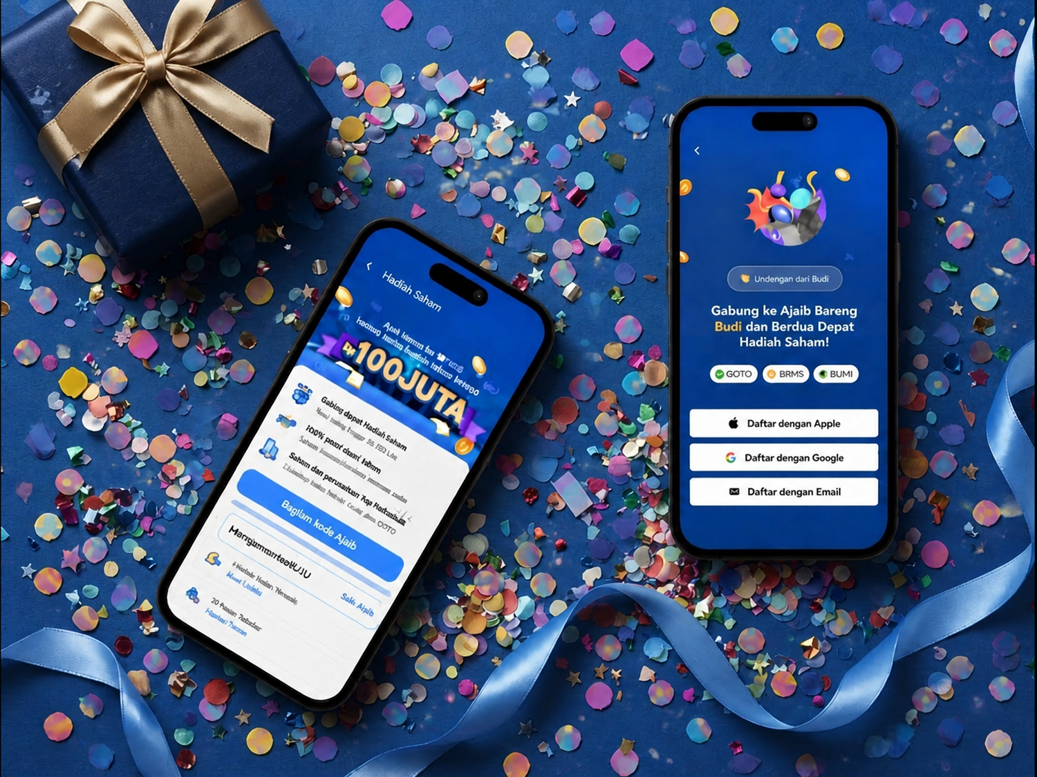
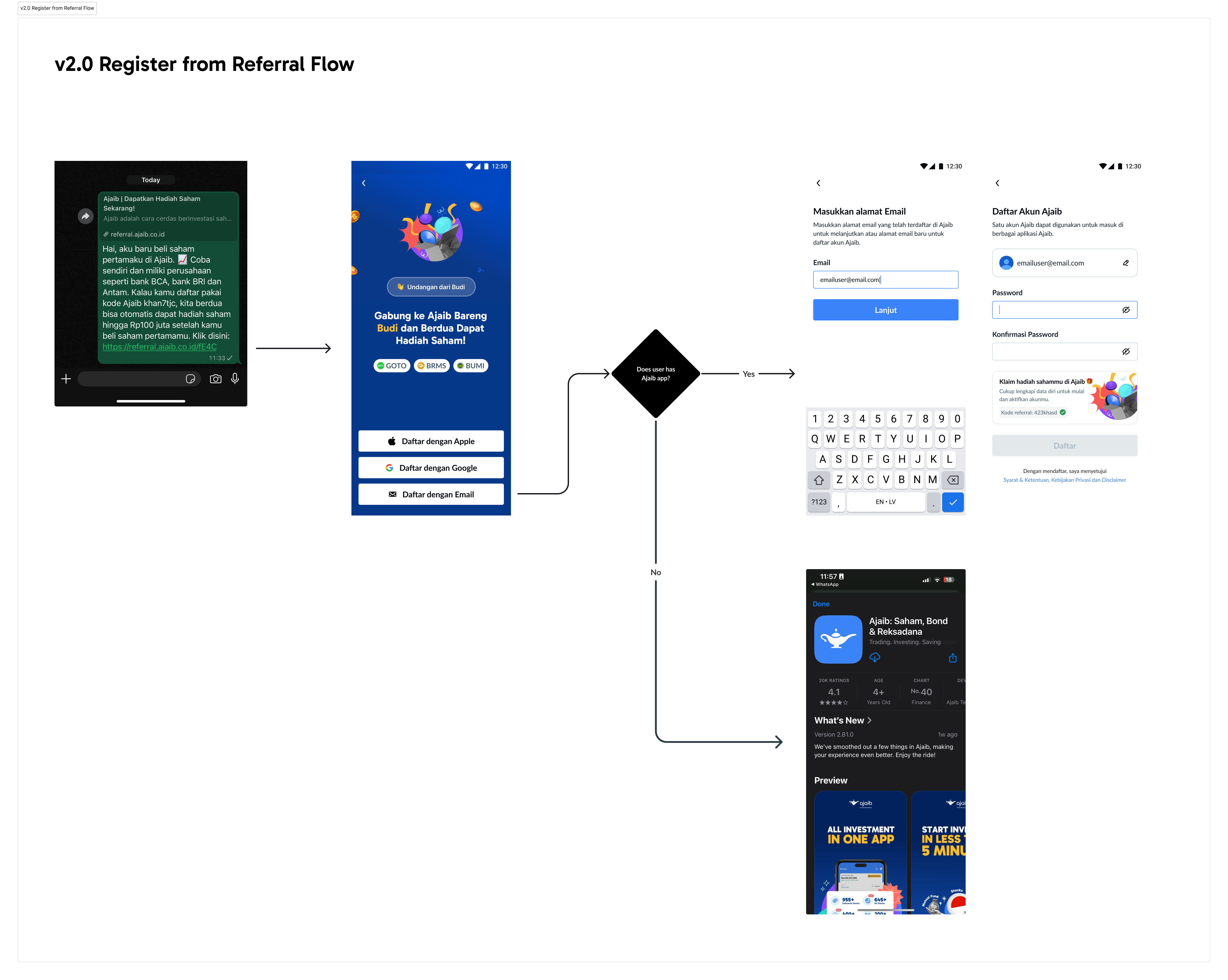
Left : Refferal Page; Right: Referee Page (by invitation)
For adoption, here's the screen flow for the referee after clicking the invitation from the referral link.
Results
- Higher share initiation due to single CTA & improved messaging
- Higher clarity for referees, validated in funnel behavior
- Earlier linkage improved attribution quality & nudge potential
- Cleaner onboarding narrative reduced confusion across steps
- Improved motivation through reward-centric communication
Key Learnings
- Referral success depends more on clarity and motivation than UI complexity
- Early commitment moments (landing page, auto-applied code) matter most
- Referral is not one feature — it is a multi-step story that must guide users through emotion, clarity, and reward
How This Reflects My Design Philosophy
My design philosophy centers on creating clarity — for users, for teams, and for the product itself.
In a complex environment like Ajaib’s referral system, great design isn’t just about UI; it’s about orchestrating many moving parts so users experience something simple, motivating, and trustworthy.
Operationally, I treat design as a collaborative engine — not a downstream service.
I use structured workflows, clear documentation, and early alignment rituals to help teams move faster together. Tools like Claude AI played a meaningful role here: helping me reframe problems, explore multiple solution paths quickly, and turn early discussions with PMs and engineers into clearer, more actionable directions. This reduced back-and-forth and made our collaboration tighter and more efficient.
Thankyou for reading till the end!If you have any feedback about this project or any other project that you think we can work on together, drop me a message at hello.adrixdesign@gmail.com or connect me on LinkedIn.